
Graphing my Life with Matplotlib
Sun Mar 01 2020
Let’s do a deep dive and start visualizing my life using Fitbit and Matplotlib.
1 What is Fitbit
Fitbit is a fitness watch that tracks your sleep, heart rate, and activity. Fitbit is able to track your steps, however, it is also able to detect multiple types of activity like running, walking, “sport” and biking.
2 What is Matplotlib
Matplotlib is a python visualization library that enables you to create bar graphs, line graphs, distributions and many more things. Being able to visualize your results is essential to any person working with data at any scale. Although I like GGplot in R more than Matplotlib, Matplotlib is still my go to graphing library for Python.
3 Getting Your Fitbit Data
There are two main ways that you can get your Fitbit data:
- Fitbit API
- Data Archival Export
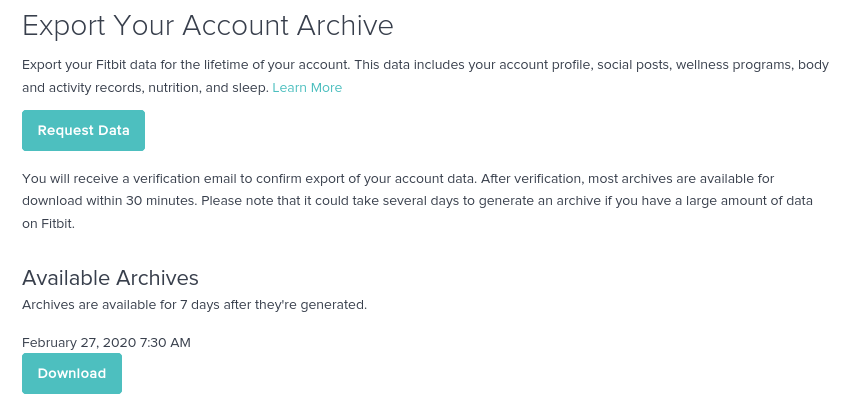
Since connecting to the API and setting up all the web hooks can be a pain, I’m just going to use the data export option because this is only for one person. You can export your data here: https://www.fitbit.com/settings/data/export.
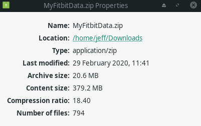
The Fitbit data archive was very organized and kept meticulous records of everything. All of the data was organized in separate JSON files labeled by date. Fitbit keeps around 1MB of data on you per day; most of this data is from the heart rate sensors. Although 1MB of data may sound like a ton of data, it is probably a lot less if you store it in formats other than JSON. When I downloaded the compressed file it was 20MB, but when I extracted it, it was 380MB! I’ve only been using Fitbit for 11 months at this point.
3.1 Sleep
Sleep is something fun to visualize. No matter how much of it you get you still feel tired as a college student. In the “sleep_score” folder of the exported data you will find a single CSV file with your resting heart rate and Fitbit’s computed sleep scores. Interesting enough, this is the only file that comes in the CSV format, everything else is JSON file.
We can read in all the data using a single liner with the Pandas python library.
import matplotlib.pyplot as plt
import pandas as pd

sleep_score_df = pd.read_csv('data/sleep/sleep_score.csv')
print(sleep_score_df) sleep_log_entry_id timestamp overall_score \
0 26093459526 2020-02-27T06:04:30Z 80
1 26081303207 2020-02-26T06:13:30Z 83
2 26062481322 2020-02-25T06:00:30Z 82
3 26045941555 2020-02-24T05:49:30Z 79
4 26034268762 2020-02-23T08:35:30Z 75
.. ... ... ...
176 23696231032 2019-09-02T07:38:30Z 79
177 23684345925 2019-09-01T07:15:30Z 84
178 23673204871 2019-08-31T07:11:00Z 74
179 23661278483 2019-08-30T06:34:00Z 73
180 23646265400 2019-08-29T05:55:00Z 80
composition_score revitalization_score duration_score \
0 20 19 41
1 22 21 40
2 22 21 39
3 17 20 42
4 20 16 39
.. ... ... ...
176 20 20 39
177 22 21 41
178 18 21 35
179 17 19 37
180 21 21 38
deep_sleep_in_minutes resting_heart_rate restlessness
0 65 60 0.117330
1 85 60 0.113188
2 95 60 0.120635
3 52 61 0.111224
4 43 59 0.154774
.. ... ... ...
176 88 56 0.170923
177 95 56 0.133268
178 73 56 0.102703
179 50 55 0.121086
180 61 57 0.112961
[181 rows x 9 columns]With the Pandas library you can generate Matplotlib graphs. Although you can directly use Matplotlib, the wrapper functions using Pandas makes it easier to use.
3.2 Sleep Score Histogram
sleep_score_df.hist(column='overall_score')array([[<matplotlib.axes._subplots.AxesSubplot object at 0x7fc2c0a270d0>]],
dtype=object)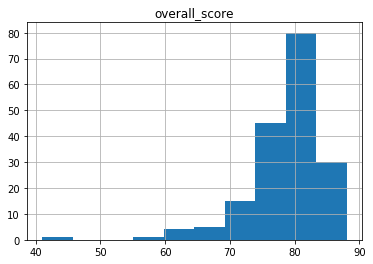
3.3 Heart Rate
Fitbit keeps their calculated heart rates in the sleep scores file rather than heart. Knowing your resting heart rate is useful because it is a good indicator of your overall health.
sleep_score_df.hist(column='resting_heart_rate')array([[<matplotlib.axes._subplots.AxesSubplot object at 0x7fc2917a6090>]],
dtype=object)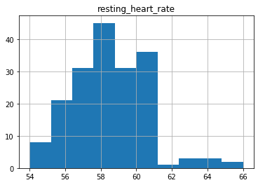
3.4 Resting Heart Rate Time Graph
Using the pandas wrapper we can quickly create a heart rate graph over time.
sleep_score_df.plot(kind='line', y='resting_heart_rate', x ='timestamp', legend=False, title="Resting Heart Rate(BPM)")<matplotlib.axes._subplots.AxesSubplot at 0x7fc28f609b50>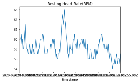
However, as we notice with the graph above, the time axis is wack. In the pandas data frame everything was stored as a string timestamp. We can convert this into a datetime object by telling pandas to parse the date as it reads it.
sleep_score_df = pd.read_csv('data/sleep/sleep_score.csv', parse_dates=[1])
sleep_score_df.plot(kind='line', y='resting_heart_rate', x ='timestamp', legend=False, title="Resting Heart Rate(BPM)")
<matplotlib.axes._subplots.AxesSubplot at 0x7fc28f533510>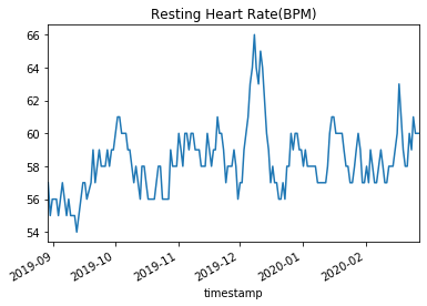
To fully manipulate the graphs, we need to use some matplotlib code to do things like setting the axis labels or make multiple plots right next to each other. We can create grab the current axis being used by matplotlib by using plt.gca().
ax = plt.gca()
sleep_score_df.plot(kind='line', y='resting_heart_rate', x ='timestamp', legend=False, title="Resting Heart Rate Graph", ax=ax, figsize=(10, 5))
plt.xlabel("Date")
plt.ylabel("Resting Heart Rate (BPM)")
plt.show()

#plt.savefig('restingHeartRate.svg')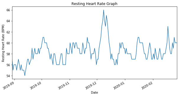
The same thing can be done with sleep scores. It is interesting to note that the sleep scores rarely vary anything between 75 and 85.
ax = plt.gca()
sleep_score_df.plot(kind='line', y='overall_score', x ='timestamp', legend=False, title="Sleep Score Time Series Graph", ax=ax)
plt.xlabel("Date")
plt.ylabel("Fitbit's Sleep Score")
plt.show()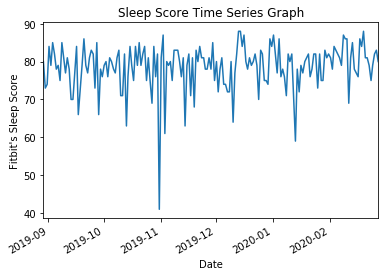
Using Pandas we can generate a new column with a specific date attribute like year, day, month, or weekday. If we add a new column for weekday, we can then group by weekday and collapse them all into a single column by summing or averaging the value.
temp = pd.DatetimeIndex(sleep_score_df['timestamp'])
sleep_score_df['weekday'] = temp.weekday

print(sleep_score_df)
sleep_log_entry_id timestamp overall_score \
0 26093459526 2020-02-27 06:04:30+00:00 80
1 26081303207 2020-02-26 06:13:30+00:00 83
2 26062481322 2020-02-25 06:00:30+00:00 82
3 26045941555 2020-02-24 05:49:30+00:00 79
4 26034268762 2020-02-23 08:35:30+00:00 75
.. ... ... ...
176 23696231032 2019-09-02 07:38:30+00:00 79
177 23684345925 2019-09-01 07:15:30+00:00 84
178 23673204871 2019-08-31 07:11:00+00:00 74
179 23661278483 2019-08-30 06:34:00+00:00 73
180 23646265400 2019-08-29 05:55:00+00:00 80
composition_score revitalization_score duration_score \
0 20 19 41
1 22 21 40
2 22 21 39
3 17 20 42
4 20 16 39
.. ... ... ...
176 20 20 39
177 22 21 41
178 18 21 35
179 17 19 37
180 21 21 38
deep_sleep_in_minutes resting_heart_rate restlessness weekday
0 65 60 0.117330 3
1 85 60 0.113188 2
2 95 60 0.120635 1
3 52 61 0.111224 0
4 43 59 0.154774 6
.. ... ... ... ...
176 88 56 0.170923 0
177 95 56 0.133268 6
178 73 56 0.102703 5
179 50 55 0.121086 4
180 61 57 0.112961 3
[181 rows x 10 columns]print(sleep_score_df.groupby('weekday').mean()) sleep_log_entry_id overall_score composition_score \
weekday
0 2.483733e+10 79.576923 20.269231
1 2.485200e+10 77.423077 20.423077
2 2.490383e+10 80.880000 21.120000
3 2.483418e+10 76.814815 20.370370
4 2.480085e+10 79.769231 20.961538
5 2.477002e+10 78.840000 20.520000
6 2.482581e+10 77.230769 20.269231
revitalization_score duration_score deep_sleep_in_minutes \
weekday
0 19.153846 40.153846 88.000000
1 19.000000 38.000000 83.846154
2 19.400000 40.360000 93.760000
3 19.037037 37.407407 82.592593
4 19.346154 39.461538 94.461538
5 19.080000 39.240000 93.720000
6 18.269231 38.692308 89.423077
resting_heart_rate restlessness
weekday
0 58.576923 0.139440
1 58.538462 0.142984
2 58.560000 0.138661
3 58.333333 0.135819
4 58.269231 0.129791
5 58.080000 0.138315
6 58.153846 0.147171 3.5 Sleep Score Based on Day
ax = plt.gca()
sleep_score_df.groupby('weekday').mean().plot(kind='line', y='overall_score', ax = ax)
plt.ylabel("Sleep Score")
plt.title("Sleep Scores on Varying Days of Week")
plt.show()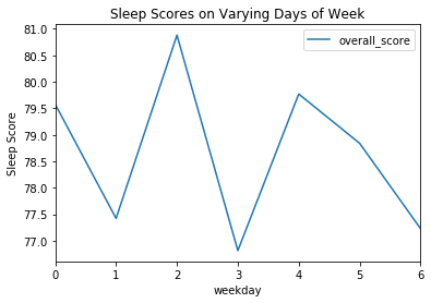
3.6 Sleep Score Based on Days of Week
ax = plt.gca()
sleep_score_df.groupby('weekday').mean().plot(kind='line', y='resting_heart_rate', ax = ax)
plt.ylabel("Resting heart rate (BPM)")
plt.title("Resting Heart Rate Varying Days of Week")
plt.show()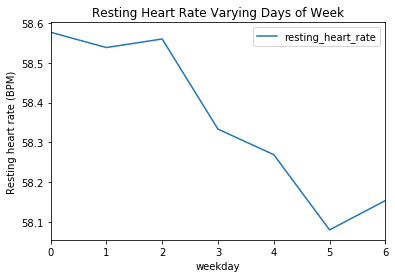
4 Calories
Fitbit keeps all of their calorie data in JSON files representing sequence data at 1 minute increments. To extrapolate calorie data we need to group by day and then sum the days to get the total calories burned per day.
calories_df = pd.read_json("data/calories/calories-2019-07-01.json", convert_dates=True)print(calories_df) dateTime value
0 2019-07-01 00:00:00 1.07
1 2019-07-01 00:01:00 1.07
2 2019-07-01 00:02:00 1.07
3 2019-07-01 00:03:00 1.07
4 2019-07-01 00:04:00 1.07
... ... ...
43195 2019-07-30 23:55:00 1.07
43196 2019-07-30 23:56:00 1.07
43197 2019-07-30 23:57:00 1.07
43198 2019-07-30 23:58:00 1.07
43199 2019-07-30 23:59:00 1.07
[43200 rows x 2 columns]import datetime
calories_df['date_minus_time'] = calories_df["dateTime"].apply( lambda calories_df :
datetime.datetime(year=calories_df.year, month=calories_df.month, day=calories_df.day))
calories_df.set_index(calories_df["date_minus_time"],inplace=True)
print(calories_df) dateTime value date_minus_time
date_minus_time
2019-07-01 2019-07-01 00:00:00 1.07 2019-07-01
2019-07-01 2019-07-01 00:01:00 1.07 2019-07-01
2019-07-01 2019-07-01 00:02:00 1.07 2019-07-01
2019-07-01 2019-07-01 00:03:00 1.07 2019-07-01
2019-07-01 2019-07-01 00:04:00 1.07 2019-07-01
... ... ... ...
2019-07-30 2019-07-30 23:55:00 1.07 2019-07-30
2019-07-30 2019-07-30 23:56:00 1.07 2019-07-30
2019-07-30 2019-07-30 23:57:00 1.07 2019-07-30
2019-07-30 2019-07-30 23:58:00 1.07 2019-07-30
2019-07-30 2019-07-30 23:59:00 1.07 2019-07-30
[43200 rows x 3 columns]calories_per_day = calories_df.resample('D').sum()
print(calories_per_day) value
date_minus_time
2019-07-01 3422.68
2019-07-02 2705.85
2019-07-03 2871.73
2019-07-04 4089.93
2019-07-05 3917.91
2019-07-06 2762.55
2019-07-07 2929.58
2019-07-08 2698.99
2019-07-09 2833.27
2019-07-10 2529.21
2019-07-11 2634.25
2019-07-12 2953.91
2019-07-13 4247.45
2019-07-14 2998.35
2019-07-15 2846.18
2019-07-16 3084.39
2019-07-17 2331.06
2019-07-18 2849.20
2019-07-19 2071.63
2019-07-20 2746.25
2019-07-21 2562.11
2019-07-22 1892.99
2019-07-23 2372.89
2019-07-24 2320.42
2019-07-25 2140.87
2019-07-26 2430.38
2019-07-27 3769.04
2019-07-28 2036.24
2019-07-29 2814.87
2019-07-30 2077.82ax = plt.gca()
calories_per_day.plot(kind='hist', title="Calorie Distribution", legend=False, ax=ax)
plt.show()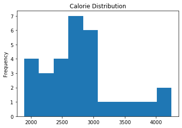
ax = plt.gca()
calories_per_day.plot(kind='line', y='value', legend=False, title="Calories Per Day", ax=ax)
plt.xlabel("Date")
plt.ylabel("Calories")
plt.show()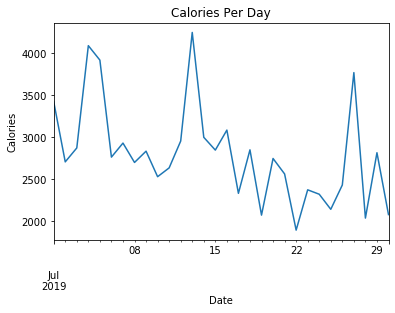
4.1 Calories Per Day Box Plot
Using this data we can turn this into a boxplot to make it easier to visualize the distribution of calories burned during the month of July.
ax = plt.gca()
ax.set_title('Calorie Distribution for July')
ax.boxplot(calories_per_day['value'], vert=False,manage_ticks=False, notch=True)
plt.xlabel("Calories Burned")
ax.set_yticks([])
plt.show()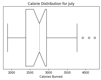
5 Steps
Fitbit is known for taking the amount of steps someone takes per day. Similar to calories burned, steps taken is stored in time series data at 1 minute increments. Since we are interested at the day level data, we need to first remove the time component of the dataframe so that we can group all the data by date. Once we have everything grouped by date, we can sum and produce steps per day.
steps_df = pd.read_json("data/steps-2019-07-01.json",  convert_dates=True)

steps_df['date_minus_time'] = steps_df["dateTime"].apply( lambda steps_df :
    datetime.datetime(year=steps_df.year, month=steps_df.month, day=steps_df.day))

steps_df.set_index(steps_df["date_minus_time"],inplace=True)
print(steps_df)
dateTime value date_minus_time
date_minus_time
2019-07-01 2019-07-01 04:00:00 0 2019-07-01
2019-07-01 2019-07-01 04:01:00 0 2019-07-01
2019-07-01 2019-07-01 04:02:00 0 2019-07-01
2019-07-01 2019-07-01 04:03:00 0 2019-07-01
2019-07-01 2019-07-01 04:04:00 0 2019-07-01
... ... ... ...
2019-07-31 2019-07-31 03:55:00 0 2019-07-31
2019-07-31 2019-07-31 03:56:00 0 2019-07-31
2019-07-31 2019-07-31 03:57:00 0 2019-07-31
2019-07-31 2019-07-31 03:58:00 0 2019-07-31
2019-07-31 2019-07-31 03:59:00 0 2019-07-31
[41116 rows x 3 columns]steps_per_day = steps_df.resample('D').sum()
print(steps_per_day) value
date_minus_time
2019-07-01 11285
2019-07-02 4957
2019-07-03 13119
2019-07-04 16034
2019-07-05 11634
2019-07-06 6860
2019-07-07 3758
2019-07-08 9130
2019-07-09 10960
2019-07-10 7012
2019-07-11 5420
2019-07-12 4051
2019-07-13 15980
2019-07-14 23109
2019-07-15 11247
2019-07-16 10170
2019-07-17 4905
2019-07-18 10769
2019-07-19 4504
2019-07-20 5032
2019-07-21 8953
2019-07-22 2200
2019-07-23 9392
2019-07-24 5666
2019-07-25 5016
2019-07-26 5879
2019-07-27 19492
2019-07-28 4987
2019-07-29 9943
2019-07-30 3897
2019-07-31 1665.1 Steps Per Day Histogram
After the data is in the form that we want, graphing the data is straight forward. Two added things I like to do for normal box plots is to set the displays to horizontal add the notches.
ax = plt.gca()
ax.set_title('Steps Distribution for July')
ax.boxplot(steps_per_day['value'], vert=False,manage_ticks=False, notch=True)
plt.xlabel("Steps Per Day")
ax.set_yticks([])
plt.show()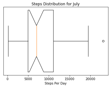
Wrapping that all into a single function we get something like this:
def readFileIntoDataFrame(fName):
    steps_df = pd.read_json(fName,  convert_dates=True)

    steps_df['date_minus_time'] = steps_df["dateTime"].apply( lambda steps_df :
        datetime.datetime(year=steps_df.year, month=steps_df.month, day=steps_df.day))

    steps_df.set_index(steps_df["date_minus_time"],inplace=True)
    return steps_df.resample('D').sum()

def graphBoxAndWhiskers(data, title, xlab):
    ax = plt.gca()
    ax.set_title(title)
    ax.boxplot(data['value'], vert=False, manage_ticks=False, notch=True)
    plt.xlabel(xlab)
    ax.set_yticks([])
    plt.show()
graphBoxAndWhiskers(readFileIntoDataFrame("data/steps-2020-01-27.json"), "Steps In January", "Steps Per Day")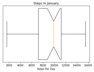
That is cool, but, what if we could view the distribution for each month in the same graph? Based on the two previous graphs, my step distribution during July looked distinctly different from my step distribution in January. The first difficultly would be to read in all the files since Fitbit creates a new file for every month. The next thing would be to group them by month and then graph it.
import os
files = os.listdir("data")
print(files)
['steps-2019-04-02.json', 'steps-2019-08-30.json', 'steps-2020-02-26.json', 'steps-2019-10-29.json', 'steps-2019-07-01.json', 'steps-2020-01-27.json', 'steps-2019-07-31.json', 'steps-2019-06-01.json', 'steps-2019-09-29.json', '.ipynb_checkpoints', 'steps-2019-12-28.json', 'steps-2019-05-02.json', 'calories', 'steps-2019-11-28.json', 'sleep']dfs = []
for file in files: # this can take 15 seconds
if "steps" in file: # finds the steps files
dfs.append(readFileIntoDataFrame("data/" + file))stepsPerDay = pd.concat(dfs)
graphBoxAndWhiskers(stepsPerDay, "Steps Per Day Last 11 Months", "Steps per Day")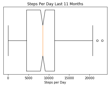
print(type(stepsPerDay['value'].to_numpy()))
print(stepsPerDay['value'].keys())

stepsPerDay['month'] = pd.DatetimeIndex(stepsPerDay['value'].keys()).month
stepsPerDay['week_day'] = pd.DatetimeIndex(stepsPerDay['value'].keys()).weekday

print(stepsPerDay)
<class 'numpy.ndarray'>
DatetimeIndex(['2019-04-03', '2019-04-04', '2019-04-05', '2019-04-06',
'2019-04-07', '2019-04-08', '2019-04-09', '2019-04-10',
'2019-04-11', '2019-04-12',
...
'2019-12-19', '2019-12-20', '2019-12-21', '2019-12-22',
'2019-12-23', '2019-12-24', '2019-12-25', '2019-12-26',
'2019-12-27', '2019-12-28'],
dtype='datetime64[ns]', name='date_minus_time', length=342, freq=None)
value month week_day
date_minus_time
2019-04-03 510 4 2
2019-04-04 11453 4 3
2019-04-05 12684 4 4
2019-04-06 12910 4 5
2019-04-07 3368 4 6
... ... ... ...
2019-12-24 5779 12 1
2019-12-25 4264 12 2
2019-12-26 4843 12 3
2019-12-27 9609 12 4
2019-12-28 2218 12 5
[342 rows x 3 columns]5.2 Graphing Steps by Month
Now that we have columns for the total amount of steps per day and the months, we can plot all the data on a single plot using the group by operator in the plotting library.
ax = plt.gca()
ax.set_title('Steps Distribution for July\n')
stepsPerDay.boxplot(column=['value'], by='month',ax=ax, notch=True)
plt.xlabel("Month")
plt.ylabel("Steps Per Day")
plt.show()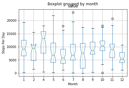
ax = plt.gca()
ax.set_title('Steps Distribution By Week Day\n')
stepsPerDay.boxplot(column=['value'], by='week_day',ax=ax, notch=True)
plt.xlabel("Week Day")
plt.ylabel("Steps Per Day")
plt.show()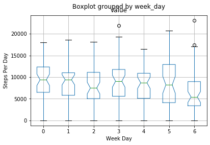
5.3 Future Work
Moving forward with this I would like to do more visualizations with sleep data and heart rate.
Recent Posts
Server Monitoring and Restart Using a Raspberry PiMy Wall Mounted Raspberry Pi Homelab
The Data Spotify Collected On Me Over Ten Years
Visualizing Fitbit GPS Data
Running a Minecraft Server With Docker
DIY Video Hosting Server
Running Scala Code in Docker
Quadtree Animations with Matplotlib
2020 in Review
Segmenting Images With Quadtrees