
The Data Spotify Collected On Me Over Ten Years
Sun Jan 18 2026
After using spotify for ten years, I decided to make a GDPR request and retrieve all the data that Spotify had collected on me. I intended to make a light hearted blog post that just visualized some data like a: “Spotify Wrapped but for 10 years”… After looking at the extensive amount of data that Spotify collected on me, I was a bit taken aback and decided to ditch Spotify. Recently it has become a trend to criticize Spotify for their usage of AI music and the low dividends they pay to creators– despite being the most expensive music streaming service on the market. This post is not going to add to those loud noises that are already criticizing Spotify’s business practices. This post, is going to look at Spotify’s extensive data collection and analyze my music listening habits to make an objective cost base analysis on if I would have been better off purchasing music instead of streaming from Spotify.
1 Downloading the Data
Under GDPR law, Spotify is legally obligated to provide you with all the personal data that they have stored on you. When you request your Spotify data, they offer the data export in three segments:
- Account Data
- Technical Log
- Extended Streaming History
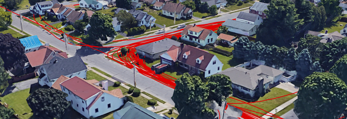
Visualizing Fitbit GPS Data
Sat May 01 2021
This post looks at how you can aggregate and visualize Fitbit GPS data since there is no built-in functionality to do this on the Fitbit website. Before you read this post, check out my two other posts on using Fitbit data:
1 Getting the Data
There are two options that we can use to fetch data from Fitbit:
- Fitbit’s Data Export Tool
- Fitbit’s API
1.1 Exporting from the Website
Quadtree Animations with Matplotlib
Mon Feb 08 2021
This post will extend my last post on image quadtrees to create an animation that varies the quadtree splitting threshold. Like all recursively dividing algorithms, as you relax the splitting parameter, more partitions get generated. Although this principle makes intuitive sense, seeing animation tells a fuller story.
This post will be using the matplotlib’s animation functionality and the quadtree code I wrote in my previous post. The following code snippet illustrates a simple animation using matplolib:
import numpy as np
from matplotlib import pyplot as plt
from matplotlib.animation import FuncAnimation

fig = plt.figure()
ax = plt.axes(xlim=(0, 4), ylim=(-2, 2))
line, = ax.plot([], [], lw=3)

def init():
    line.set_data([], [])
    return line,
def animate(i):
    x = np.linspace(0, 4, 1000)
    y = np.sin(2 * np.pi * (x - 0.01 * i))
    line.set_data(x, y)
    return line,

anim = FuncAnimation(fig, animate, init_func=init,
                               frames=200, interval=20, blit=True)

anim.save('Wave.gif')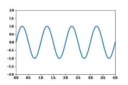
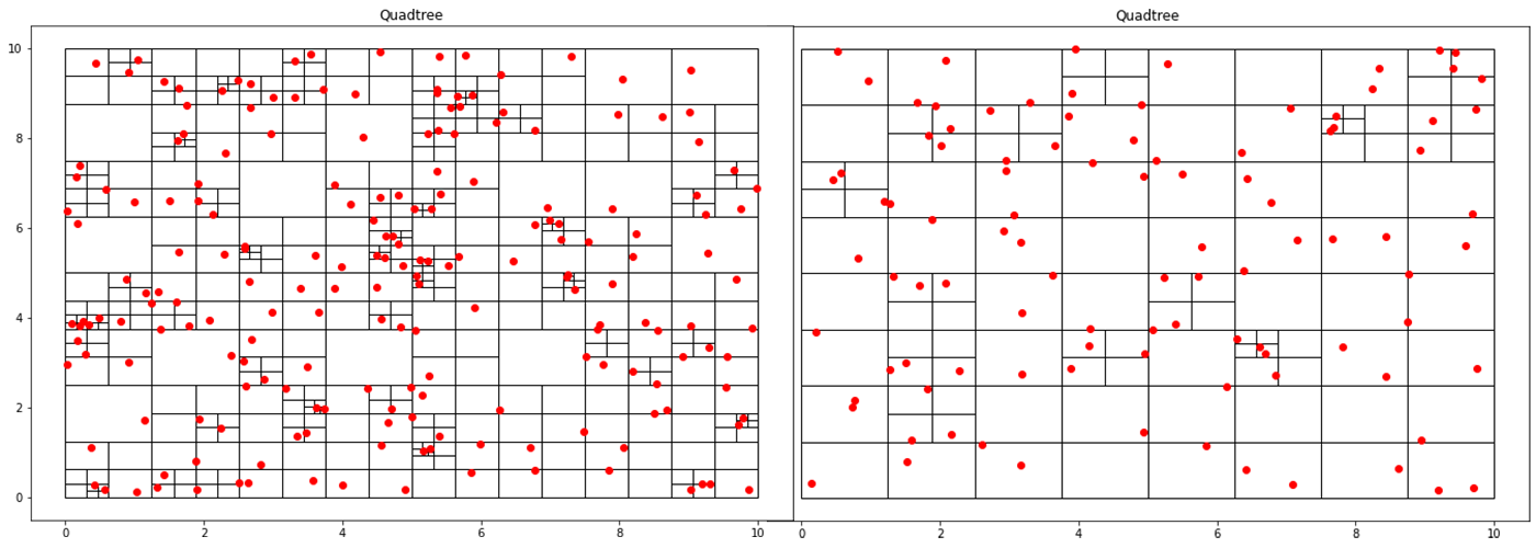
Implementing a Quadtree in Python
Sat Oct 10 2020
This blog post is the first part of a multi-post series on using quadtrees in Python. This post goes over quadtrees’ basics and how you can implement a basic point quadtree in Python. Future posts aim to apply quadtrees in image segmentation and analysis.
A quadtree is a data structure where each node has exactly four children. This property makes it particularly suitable for spatial searching. Quadtrees are generalized as “k-d/k-dimensional” trees when you have more than 4 divisions at each node. In a point-quadtree, leaf nodes are a single unit of spatial information. A quadtree is constructed by continuously dividing each node until each leaf node only has a single node inside of it. However, this partitioning can be modified so that each leaf node contains no more than K elements or that each cell can be at a maximum X large. This stopping criterion is similar to that of the stopping criteria when creating a decision tree.
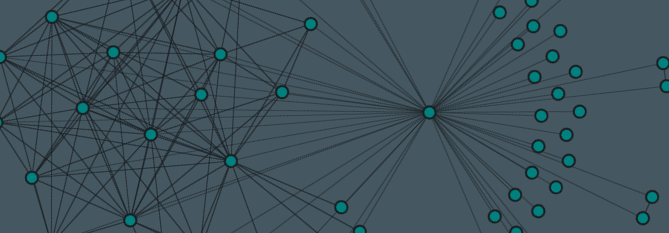
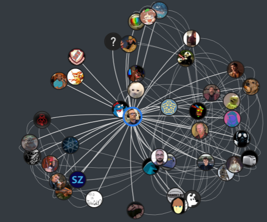
Node2vec With Steam Data
Sun Jul 26 2020
Graph algorithms!!! Working with graphs can be a great deal of fun, but sometimes we just want some cold hard vectors to do some good old-fashioned machine learning. This post looks at the famous node2vec algorithm used to quantize graph data. The example I’m giving in this blog post uses data from my recently resurrected steam graph project.
If you live under a rock, Steam is a platform where users can purchase, manage, and play games with friends. Although there is a ton of data within the Steam network, I am only interested in the graphs formed connecting users, friends, and games. My updated visualization to show a friendship network looks like this:
Recent Posts
Server Monitoring and Restart Using a Raspberry PiMy Wall Mounted Raspberry Pi Homelab
The Data Spotify Collected On Me Over Ten Years
Visualizing Fitbit GPS Data
Running a Minecraft Server With Docker
DIY Video Hosting Server
Running Scala Code in Docker
Quadtree Animations with Matplotlib
2020 in Review
Segmenting Images With Quadtrees