Time Spent In Steam Games
Mon Jul 20 2020
Last week I scrapped a bunch of data from the Steam API using my Steam Graph Project. This project captures steam users, their friends, and the games that they own. Using the Janus-Graph traversal object, I use the Gremlin graph query language to pull this data. Since I am storing the hours played in a game as a property on the relationship between a player and a game node, I had to make a “join” statement to get the hours property with the game information in a single query.
Object o = graph.con.getTraversal()
    .V()
    .hasLabel(Game.KEY_DB)
    .match(
            __.as("c").values(Game.KEY_STEAM_GAME_ID).as("gameID"),
            __.as("c").values(Game.KEY_GAME_NAME).as("gameName"),
            __.as("c").inE(Game.KEY_RELATIONSHIP).values(Game.KEY_PLAY_TIME).as("time")
    ).select("gameID", "time", "gameName").toList();
WrappedFileWriter.writeToFile(new Gson().toJson(o).toLowerCase(), "games.json");
Using the game indexing property on the players, I noted that I only ended up wholly indexing the games of 481 players after 8 hours.
graph.con.getTraversal()
    .V()
    .hasLabel(SteamGraph.KEY_PLAYER)
    .has(SteamGraph.KEY_CRAWLED_GAME_STATUS, 1)
    .count().next()
We now transition to Python and Matlptlib to visualize the data exported from our JanusGraph Query as a JSON object. The dependencies for this notebook can get installed using pip.
!pip install pandas
!pip install matplotlib
Collecting pandas
Downloading pandas-1.0.5-cp38-cp38-manylinux1_x86_64.whl (10.0 MB)
[K |████████████████████████████████| 10.0 MB 4.3 MB/s eta 0:00:01
[?25hCollecting pytz>=2017.2
Downloading pytz-2020.1-py2.py3-none-any.whl (510 kB)
[K |████████████████████████████████| 510 kB 2.9 MB/s eta 0:00:01
[?25hRequirement already satisfied: numpy>=1.13.3 in /home/jeff/Documents/python/ml/lib/python3.8/site-packages (from pandas) (1.18.5)
Requirement already satisfied: python-dateutil>=2.6.1 in /home/jeff/Documents/python/ml/lib/python3.8/site-packages (from pandas) (2.8.1)
Requirement already satisfied: six>=1.5 in /home/jeff/Documents/python/ml/lib/python3.8/site-packages (from python-dateutil>=2.6.1->pandas) (1.15.0)
Installing collected packages: pytz, pandas
Successfully installed pandas-1.0.5 pytz-2020.1The first thing we are doing is importing our JSON data as a pandas data frame. Pandas is an open-source data analysis and manipulation tool. I enjoy pandas because it has native integration with matplotlib and supports operations like aggregations and groupings.
import matplotlib.pyplot as plt
import pandas as pd

games_df = pd.read_json('games.json')
games_df| gameid | time | gamename | |
|---|---|---|---|
| 0 | 210770 | 243 | sanctum 2 |
| 1 | 210770 | 31 | sanctum 2 |
| 2 | 210770 | 276 | sanctum 2 |
| 3 | 210770 | 147 | sanctum 2 |
| 4 | 210770 | 52 | sanctum 2 |
| ... | ... | ... | ... |
| 36212 | 9800 | 9 | death to spies |
| 36213 | 445220 | 0 | avorion |
| 36214 | 445220 | 25509 | avorion |
| 36215 | 445220 | 763 | avorion |
| 36216 | 445220 | 3175 | avorion |
36217 rows × 3 columns
Using the built-in matplotlib wrapper function, we can graph a histogram of the number of hours played in a game.
ax = games_df.hist(column='time', bins=20, range=(0, 4000))
ax=ax[0][0]
ax.set_title("Game Play Distribution")
ax.set_xlabel("Minutes Played")
ax.set_ylabel("Frequency")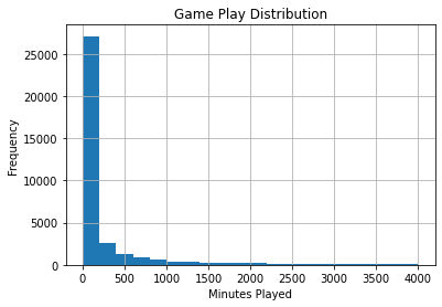
Notice that the vast majority of the games are rarely ever played, however, it is skewed to the right with a lot of outliers. We can change the scale to make it easier to view using the range parameter.
ax = games_df.hist(column='time', bins=20, range=(0, 100))
ax=ax[0][0]
ax.set_title("Game Play Distribution")
ax.set_xlabel("Minutes Played")
ax.set_ylabel("Frequency")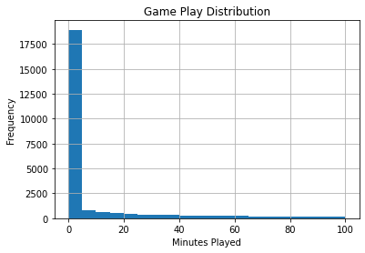
If we remove games that have never been played, the distribution looks more reasonable.
ax = games_df.hist(column='time', bins=20, range=(2, 100))
ax=ax[0][0]
ax.set_title("Game Play Distribution")
ax.set_xlabel("Minutes Played")
ax.set_ylabel("Frequency")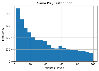
Although histograms are useful, viewing the CDF is often more helpful since it is easier to extract numerical information.
ax = games_df.hist(column='time',density=True, range=(0, 2000),  histtype='step',cumulative=True)
ax=ax[0][0]
ax.set_title("Game Play Distribution")
ax.set_xlabel("Minutes Played")
ax.set_ylabel("Frequency")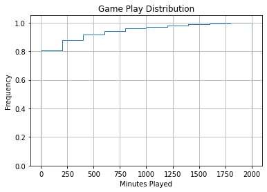
According to this graph, about 80% of people on steam who own a game, play it under 4 hours. Nearly half of all downloaded or purchased steam games go un-played. This data is a neat example of the legendary 80/20 principle – aka the Pareto principle. The Pareto principle states that roughly 80% of the effects come from 20% of the causes. IE: 20% of software bugs result in 80% of debugging time.
As mentioned earlier, the time in owned game distribution is heavily skewed to the right.
ax = plt.gca()
ax.set_title('Game Play Distribution')
ax.boxplot(games_df['time'], vert=False,manage_ticks=False, notch=True)
plt.xlabel("Game Play in Minutes")
ax.set_yticks([])
plt.show()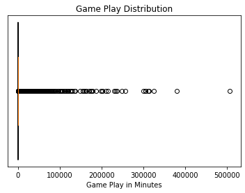
When zooming in on the distribution, we see that nearly half of all the purchased games go un-opened.
ax = plt.gca()
ax.set_title('Game Play Distribution')
ax.boxplot(games_df['time']/60, vert=False,manage_ticks=False, notch=True)
plt.xlabel("Game Play in Hours")
ax.set_yticks([])
ax.set_xlim([0, 10])
plt.show()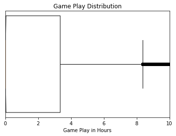
Viewing the aggregate pool of hours in particular game data is insightful; however, comparing different games against each other is more interesting. In pandas, after we create a grouping on a column, we can aggregate it into metrics such as max, min, mean, etc. I am also sorting the data I get by count since we are more interested in “popular” games.
stats_df = (games_df.groupby("gamename")
                    .agg({'time': ['count', "min", 'max', 'mean']})
                    .sort_values(by=('time', 'count')))
stats_df| time | ||||
|---|---|---|---|---|
| count | min | max | mean | |
| gamename | ||||
| 龙魂时刻 | 1 | 14 | 14 | 14.000000 |
| gryphon knight epic | 1 | 0 | 0 | 0.000000 |
| growing pains | 1 | 0 | 0 | 0.000000 |
| shoppy mart: steam edition | 1 | 0 | 0 | 0.000000 |
| ground pounders | 1 | 0 | 0 | 0.000000 |
| ... | ... | ... | ... | ... |
| payday 2 | 102 | 0 | 84023 | 5115.813725 |
| team fortress 2 | 105 | 7 | 304090 | 25291.180952 |
| unturned | 107 | 0 | 16974 | 1339.757009 |
| garry's mod | 121 | 0 | 311103 | 20890.314050 |
| counter-strike: global offensive | 129 | 0 | 506638 | 46356.209302 |
9235 rows × 4 columns
To prevent one-off esoteric games that I don’t have a lot of data for, throwing off metrics, I am disregarding any games that I have less than ten values for.
stats_df = stats_df[stats_df[('time', 'count')] > 10]
stats_df| time | ||||
|---|---|---|---|---|
| count | min | max | mean | |
| gamename | ||||
| serious sam hd: the second encounter | 11 | 0 | 329 | 57.909091 |
| grim fandango remastered | 11 | 0 | 248 | 35.000000 |
| evga precision x1 | 11 | 0 | 21766 | 2498.181818 |
| f.e.a.r. 2: project origin | 11 | 0 | 292 | 43.272727 |
| transistor | 11 | 0 | 972 | 298.727273 |
| ... | ... | ... | ... | ... |
| payday 2 | 102 | 0 | 84023 | 5115.813725 |
| team fortress 2 | 105 | 7 | 304090 | 25291.180952 |
| unturned | 107 | 0 | 16974 | 1339.757009 |
| garry's mod | 121 | 0 | 311103 | 20890.314050 |
| counter-strike: global offensive | 129 | 0 | 506638 | 46356.209302 |
701 rows × 4 columns
We see that the average, the playtime per player per game, is about 5 hours. However, as noted before, most purchased games go un-played.
ax = plt.gca()
ax.set_title('Game Play Distribution')
ax.boxplot(stats_df[('time', 'mean')]/60, vert=False,manage_ticks=False, notch=True)
plt.xlabel("Mean Game Play in Hours")
ax.set_xlim([0, 40])
ax.set_yticks([])
plt.show()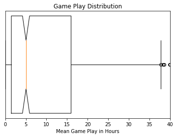
I had a hunch that more popular games got played more; however, this dataset is still too small the verify this hunch.
stats_df.plot.scatter(x=('time', 'count'), y=('time', 'mean'))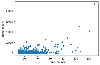
We can create a new filtered data frame that only contains the result of a single game to graph it. cc_df = games_df[games_df['gamename'] == "counter-strike: global offensive"]
cc_df| gameid | time | gamename | |
|---|---|---|---|
| 13196 | 730 | 742 | counter-strike: global offensive |
| 13197 | 730 | 16019 | counter-strike: global offensive |
| 13198 | 730 | 1781 | counter-strike: global offensive |
| 13199 | 730 | 0 | counter-strike: global offensive |
| 13200 | 730 | 0 | counter-strike: global offensive |
| ... | ... | ... | ... |
| 13320 | 730 | 3867 | counter-strike: global offensive |
| 13321 | 730 | 174176 | counter-strike: global offensive |
| 13322 | 730 | 186988 | counter-strike: global offensive |
| 13323 | 730 | 103341 | counter-strike: global offensive |
| 13324 | 730 | 10483 | counter-strike: global offensive |
129 rows × 3 columns
It is shocking how many hours certain people play in Counter-Strike. The highest number in the dataset was 8,444 hours or 352 days!
ax = plt.gca()
ax.set_title('Game Play Distribution for Counter-Strike')
ax.boxplot(cc_df['time']/60, vert=False,manage_ticks=False, notch=True)
plt.xlabel("Game Play in Hours")
ax.set_yticks([])
plt.show()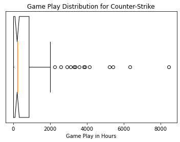
Viewing the distribution for a different game like Unturned, yields a vastly different distribution than Counter-Strike. I believe the key difference is that Counter-Strike gets played competitively, where Unturned is a more leisurely game. Competitive gamers likely skew the distribution of Counter-Strike to be very high.
u_df = games_df[games_df['gamename'] == "unturned"]
u_df| gameid | time | gamename | |
|---|---|---|---|
| 167 | 304930 | 140 | unturned |
| 168 | 304930 | 723 | unturned |
| 169 | 304930 | 1002 | unturned |
| 170 | 304930 | 1002 | unturned |
| 171 | 304930 | 0 | unturned |
| ... | ... | ... | ... |
| 269 | 304930 | 97 | unturned |
| 270 | 304930 | 768 | unturned |
| 271 | 304930 | 1570 | unturned |
| 272 | 304930 | 23 | unturned |
| 273 | 304930 | 115 | unturned |
107 rows × 3 columns
ax = plt.gca()
ax.set_title('Game Play Distribution for Unturned')
ax.boxplot(u_df['time']/60, vert=False,manage_ticks=False, notch=True)
plt.xlabel("Game Play in Hours")
ax.set_yticks([])
plt.show()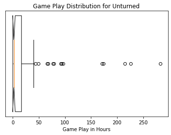
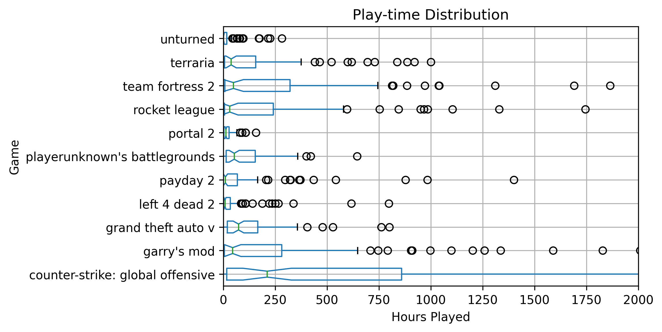
Next, I made a data frame just containing the raw data points of games that had an aggregate count of over 80. For the crawl sample size that I did, having a count of 80 would make the game “popular.” Since we only have 485 players indexed, having over 80 entries implies that over 17% of people indexed had the game. It is easy to verify that the games returned were very popular by glancing at the results.
df1 = games_df[games_df['gamename'].map(games_df['gamename'].value_counts()) > 80]
df1['time'] = df1['time']/60
df1| gameid | time | gamename | |
|---|---|---|---|
| 167 | 304930 | 2.333333 | unturned |
| 168 | 304930 | 12.050000 | unturned |
| 169 | 304930 | 16.700000 | unturned |
| 170 | 304930 | 16.700000 | unturned |
| 171 | 304930 | 0.000000 | unturned |
| ... | ... | ... | ... |
| 22682 | 578080 | 51.883333 | playerunknown's battlegrounds |
| 22683 | 578080 | 47.616667 | playerunknown's battlegrounds |
| 22684 | 578080 | 30.650000 | playerunknown's battlegrounds |
| 22685 | 578080 | 170.083333 | playerunknown's battlegrounds |
| 22686 | 578080 | 399.950000 | playerunknown's battlegrounds |
1099 rows × 3 columns
ax = df1.boxplot(column=["time"], by='gamename', notch=True, vert=False)
fig = ax.get_figure()
fig.suptitle('')
ax.set_title('Play-time Distribution')
plt.xlabel("Hours Played")
ax.set_xlim([0, 2000])
plt.ylabel("Game")
plt.savefig("playTimes.png", dpi=300, bbox_inches = "tight")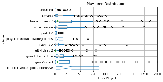
Overall it is fascinating to see how the distributions for different games vary. In the future, I will re-run some of these analytics with even more data and possibly put them on my website as an interactive graph.
Recent Posts
My Wall Mounted Raspberry Pi HomelabThe Data Spotify Collected On Me Over Ten Years
Visualizing Fitbit GPS Data
Running a Minecraft Server With Docker
DIY Video Hosting Server
Running Scala Code in Docker
Quadtree Animations with Matplotlib
2020 in Review
Segmenting Images With Quadtrees
Implementing a Quadtree in Python